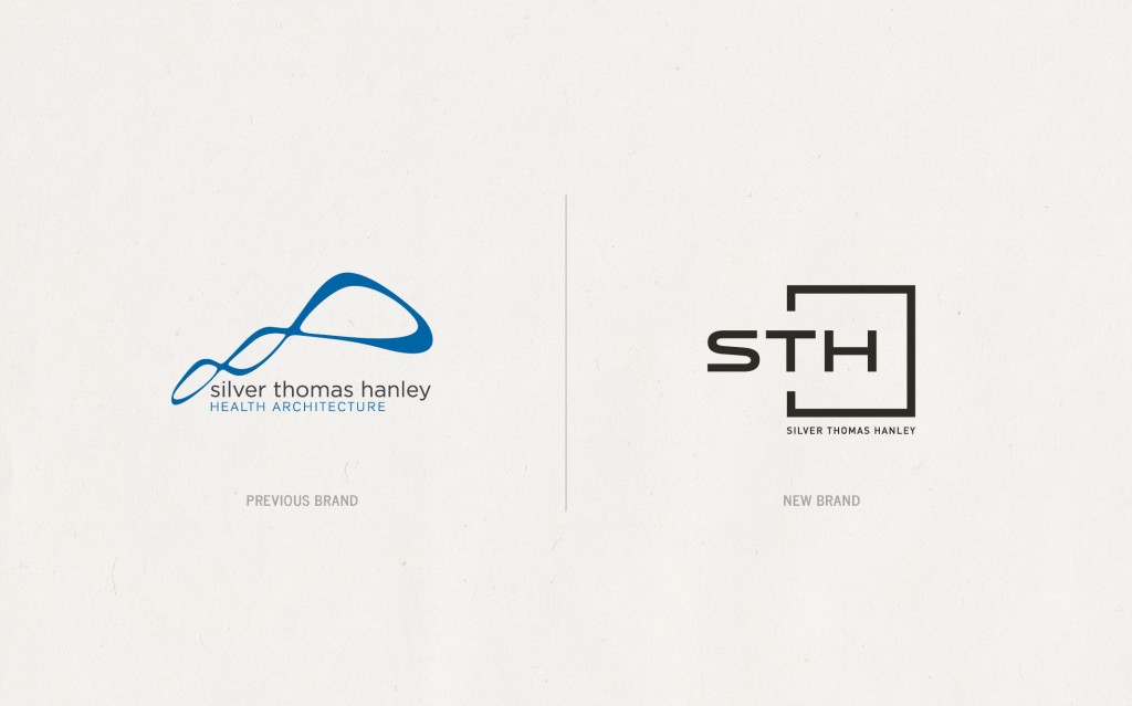
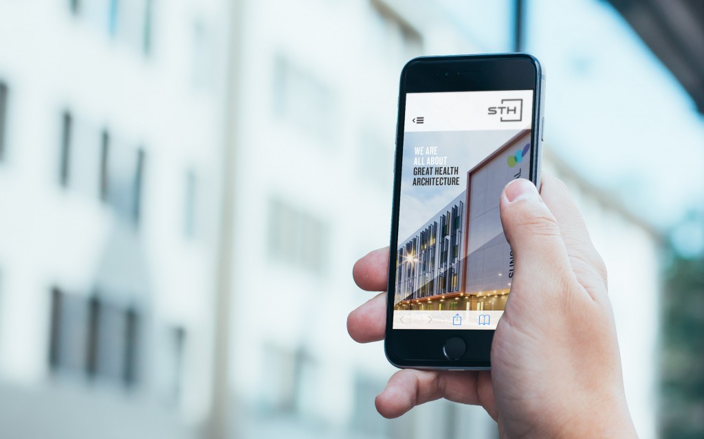
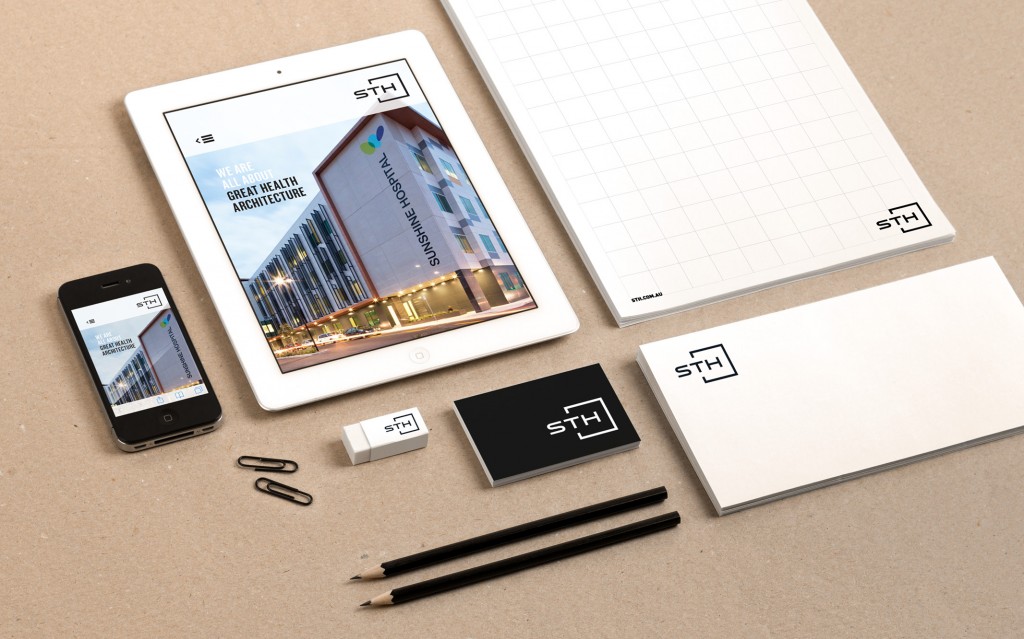
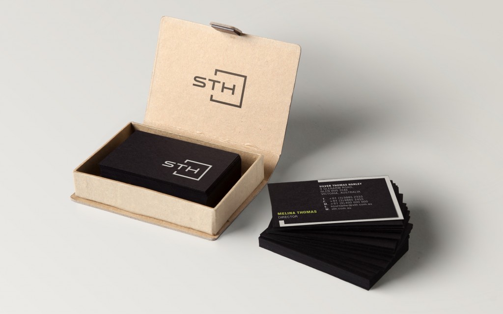
Silver Thomas Hanley weren’t happy with the strength of their brand; especially when compared to the more ‘brutal’ style of their competitors and associated suppliers. Just launched, they are really excited by their new sophisticated but simpler visual language that is being rolled out across their collateral, website, signage and fleet of cars.
As a Practice that operates in many countries, we needed a new look that symbolises their dominance in health related Architecture but still retain some warmth. They are certainly proud of their new ‘face’.