Tailored accommodation. A place to love. A space for life.
Acares provides tailored accommodation solutions for people living with a disability. Their new brand needed to strike just the right balance – professional and reliable, yet warm and approachable enough to stand out in a space that often comes across too clinical.
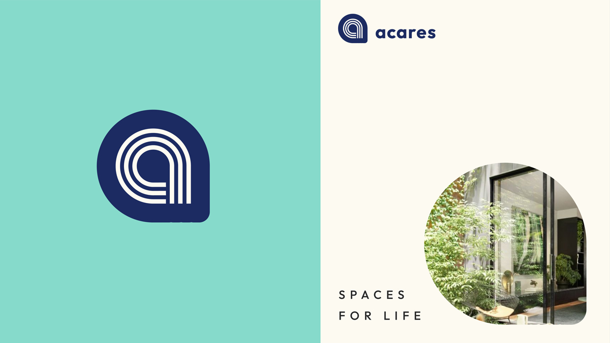
We kicked things off with ideation: exploring different ‘a’s and imagining what typefaces would be like if they were people. We arrived at the concept that the team at Acares loved – a beautifully rounded lowercase wordmark, with an ‘a’ created in linework, encapsulated by a soft-edged map marker that subtly nods to ‘a place’. A place to love. A place to grow. A place to feel connected. A space for life.
This Acares ‘map marker’ is now a hero graphic used right across their collateral. This is combined with their perfectly balanced palette… a strong, grounded – and dare we say ‘corporate’ – navy, with a fresh teal and a soft warm beige to bring a human, tactile warmth. It’s a brand ‘designed for digital’ with a warmth designed for people.
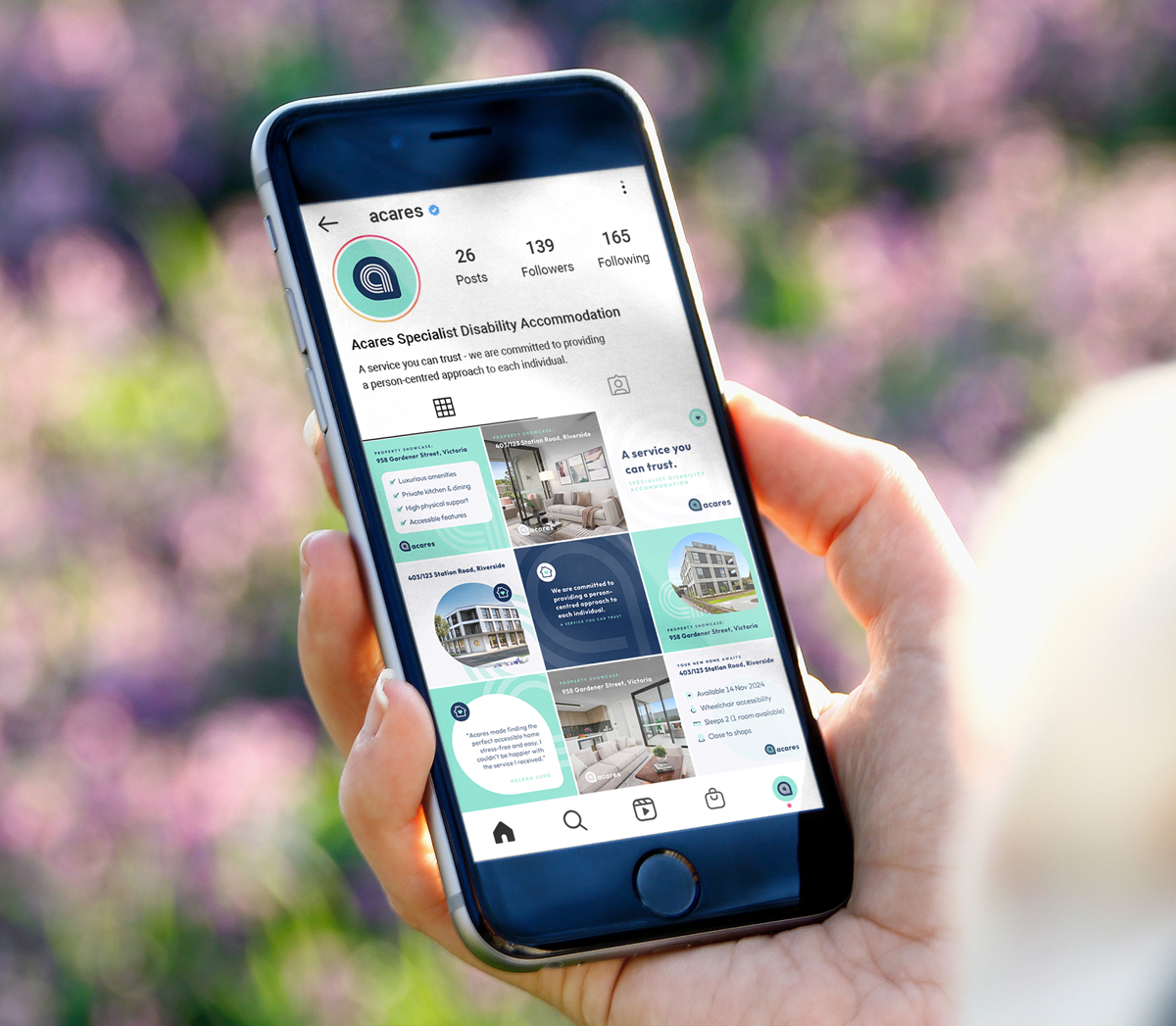
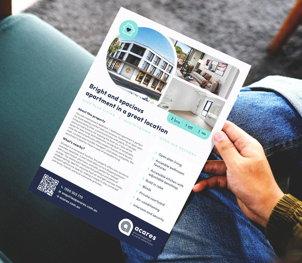
With the branding locked in, we rolled it out across a website, social templates and collateral. Clean, confident and balanced – we love the way it sits with Acares’ vibrant property photography.