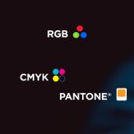
There was a time when every brand palette started with Pantone swatches on a desk and a designer squinting at tiny printed chips under perfect lighting. And while Pantones still have their place (which is probably changing too, thanks to Pantone’s new system, but that’s a whole other topic), the world our brands live in has changed. Today, the very first place your audience meets you is almost always a screen.
Because of this shift, more and more brands (including many we’ve created recently) are built using a palette with strong digital performance in mind: colours chosen for how they behave on screen first, with print as a secondary consideration. And of course, this depends entirely on the brand, their audience and where they interact with their customers most.
It’s an approach we’ve been calling the ‘digital-first palette’ (we won’t lay claim, but pretty sure this is our genius terminology!)
Why digital-first colour is becoming the norm
Your brand lives online long before it lives anywhere else. Websites, social media, email signatures, presentations, digital ads, video, the list goes on. These are the places your audience sees most often, and in many cases exclusively. But again, it depends on the brand and their customer journey. Many brands still rely heavily on print touchpoints, and for those brands a traditional palette still makes perfect sense.
So instead of anchoring everything to Pantone values and then trying to convert them for digital, we’ve flipped the process: choose colours that look incredible on screen first, then match the closest possible equivalents in print. For many brands, this offers far better flexibility and recognition in the places they appear most.
In practice, the print variations are usually subtle, and most people simply won’t notice unless the colours are held side by side under ideal conditions. What they do notice is how your brand performs digitally.
Because colour on screen behaves differently
Screens allow for vibrancy, saturation and contrast that print simply can’t achieve. When you start your palette digitally, you get access to:
- Brighter hues
- Richer gradients
- More striking contrast
- Cleaner combinations
- A more contemporary, alive feel
These qualities cut through the noise online. And in a world where audiences scroll past hundreds of brands a day, that matters. But again, this isn’t a blanket rule. For some brands, subtlety and softness are part of the strategy, and a digital-first palette may not be the right call.
Standing out is easier when everyone else is playing it safe
A surprising number of businesses are still anchored to the old rules of colour selection. Which means there’s a huge opportunity to stand out with:
- Bolder primary colours
- Unexpected combinations
- Vivid accents
- Organic, modern gradients
These digital-first palettes create a distinctive presence, especially when competitors are still relying on muted, more traditional schemes. And because most people don’t judge brands by precise colour matching the way designers do, the small print differences don’t impact recognition.
Your brand’s strategy should still lead the way
A digital-first palette isn’t about choosing the loudest colour in the box. At Brandbuild, we always come back to strategy:
- Who are you talking to
- What do you want them to feel
- What’s happening in your competitive landscape
- What colours already own the space
- How should your brand behave across different environments
From there, we choose colours that support the strategy. For some brands, a digital-first palette works beautifully. For others, a traditional Pantone-led palette is still the smartest option.
And yes, gradients are having a moment too, which work beautifully with a digital-first palette
These bold/bright palettes are now often paired with soft, organic gradients, nothing like the linear gradients of the 90s. Today’s gradients feel fluid, natural and far more adaptive. We wrote a whole article on this trend here, but the short version is: gradients make digital colour even more expressive.
The takeaway
A digital-first palette is simply one tool, not a universal rule. It depends on the brand, the audience and the strategic goals behind the identity. For brands who live mostly online, it can offer huge advantages in cut-through and personality.