Refining a bold identity for a future-focused brand
TamCorp came to us with a strong foundation and a logo with real presence, but it had one small problem: legibility. Especially at scale, it just wasn’t holding up. So, we gave it a thoughtful tweak, retaining the essence of the original mark, which had great movement, while refining its form and strengthening its impact.
From there, we expanded the brand’s visual language with graphic elements that echoed its core principles – movement, place and people. We refined the colour palette, added flexibility, and pulled it all together in a clear, usable brand style guide, along with the brand strategy that formed the building blocks of the brand.
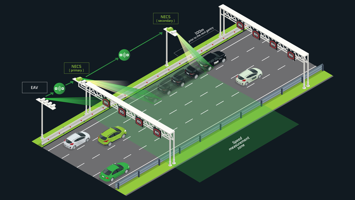
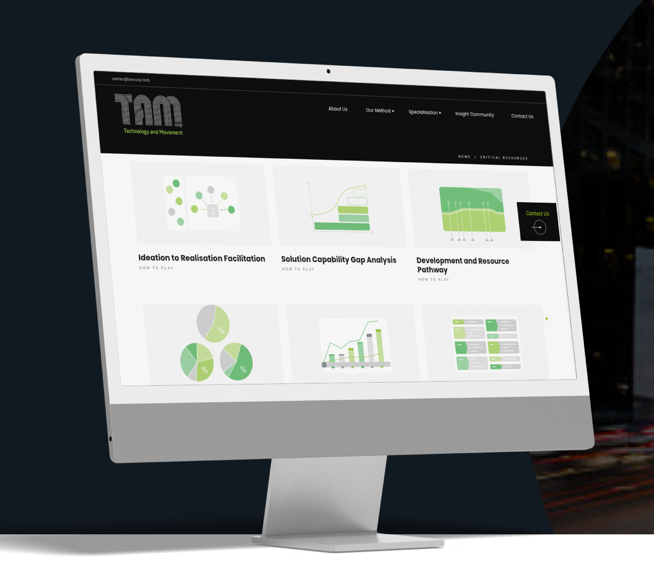
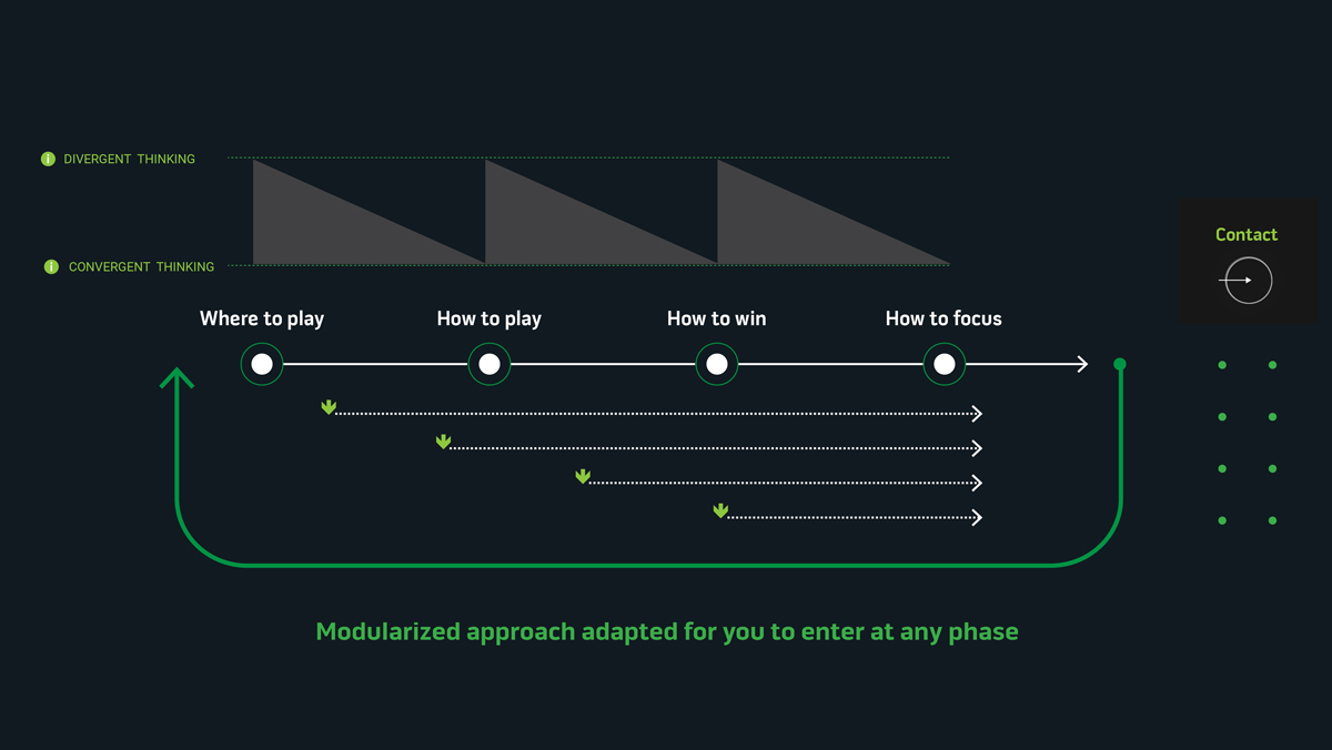
With the tone and aesthetic locked in, we designed and built a fresh website, one that served as a valuable source of information for clients and gave us the chance to have a bit of fun with a lot of infographics! To round things out, we rolled out a full suite of tools: business cards, letterheads, PowerPoint templates and more. The result? A refined, confident brand built for wherever TamCorp goes next.